21 September 2014

Chalk Time

It was time to change the lobby board (where I work) for fall time. Years ago, I had an art teacher who taught me how to chalk. "Blend!" She said, as she switched on the radio and put on the coffee pot. Each time I pull out my tenth-grade chalks, I find the best way to make each picture real with the thought of hearing "Looks great, looks great! from my high school art teacher.


Pallet Work


My dad's a carpenter -- a huge plus! I asked Dad to put some pallet wood together so I could make a sign for my office wall. He cut the wood to the requested size, sanded it, and I did the rest. Thanks, Dad.

"Props!"

Just this past week I was asked to make some photo props for a campfire-themed event. The photo op set included tree stumps, fall leaves, and a campfire, but it was missing one thing -- s'mores! Away I went!
Grab a sharpie, and get that imagination rolling! Remember, these are props. Comedic props. The bold black lines don't need to be perfect. When you finish, cut them out and be sure to leave at least a 1/8" margin which helps with the cartoon effect.

Because you don't want the visuals moving when guests are holding them, tape the dowel rods as closely as possible to the paper. A straight edge works best and will help eliminate the bubbles as well.


No one wants splinters. Once you clip the dowel rods to size, sand the tips and they're ready for the photo shoot!

Marshmallows, graham crackers, milk chocolate, even a few flames -- where's the camera?


08 August 2014

It's a wrap!

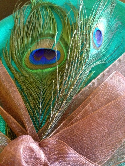
Thinking outside of the box is so much fun -- why would you stay in? Wrapping a gift recently, we didn't want to use paper. The recipient, my aunt, is so colorful and somewhat exotic. This thing needed something -- something -- uh, punchy! Off we went. My sister and I took a trip to the local fabric store and picked up a few things. Check it out.

 1) Material. Pick the right one. Ask yourself a few questions such as, "What's the recipient's style?" "What age group am I dealing with?" "What's the occasion?" All of these help to narrow your choice.


2) Add-ons. Next, we grabbed ribbon to keep the material together. Tape is unnecessary. Besides, we knew our aunt could reuse the material as she wished. NOTE: When folding the material, be neat. To avoid flapping corners, I folded them in diagonally. Don't worry about trimming all the threads. This keeps the gift looking organic, win-win! Apply the ribbon as you wish. I used a double bow then inserted a peacock feather to tie it all together.


3) Gift tag. Keep with the flow: if you're going natural, keep the idea throughout. Here, I used a thin brown ribbon threaded through the eyelet of an antiqued tag. Address it with your personal touch and...


...YOU'RE DONE! Give it a try; it's so much fun!


08 July 2014

Sign Project

I work in an eclectic part of town. Recently, I made a friend -- the owner of an antique store located just a short walking distance from where I work. The store, a gem in our small town, is always filled with quaint knick-knacks and hard-to-find salvaged pieces. Though a few people drift in daily, this Curiosity and Antiques shop is well worth reminding people. The owner now has a booth in a craft store downtown and asked if I'd make a sign to set next to the booth to remind people of the shop in our precious little neighborhood. I agreed, and away I went!


Step one was to prep the area. I require inspiration, so -- a great scene through the window, flowers on the table, old wooden no.2 Dixon pencil and notepad on the table, music through the room, and most importantly warm coffee in my hand, did the job. It's always wise to draw out a plan, especially when you're working for someone else.


TWO HOURS (and a whole lot of eraser rubbings) LATER...the format was sketched out. Fearing the idea of running out of space, I started this project by sketching the top and bottom first.


Step two was to start painting! Let me first say that knowing my client, her tastes, and the theme of the shop, it was important for me to choose appropriate colors. I chose muted vintage colors with a strong influence of antique gold. It is also extremely important to choose appropriate fonts and balance them out on the board, as well as the colors. For example, this sign could not read well with strictly one color on top and another color on bottom. My friend is fun. Spontaneous. The color scheme and layout had to follow suit.

Step three required that I slow down on the caffeine (smile) as I needed a steady hand to avoid making a mistake. Remember, never fully load your brush. It is better to pick up more paint when necessary, than glop paint down the artwork...EEK.


Step four was a little less intense. The banner didn't require straight lines which gave me a bit of a break from "form." Not desiring the flags to have a "colored in" look, I used only a dab of paint to give them a sort of worn linen look, and crosshatched brush strokes.


Step five: FINAL STEP! This is always my favorite part of these projects. Anything goes! Grab a brush or marker and accent whatever you'd like! After some shadow, embellishing dots, and tips of gold, all that was left was to erase leftover pencil marks. The work was long, tasking, and required quite a bit of caffeine (which I didn't mind in the least, wink), but it was finished and the client was thrilled with the end product -- which made it all worthwhile!


03 May 2013

sweet bird

 
There's no rule against mixing dots & lace -- get creative!

09 April 2013

It's been awhile...

Ideas, ideas, ideas! They're tracing circles 'round my head and about to land on paper, finally. I've not stopped creating altogether, I've only slowed down a bit and haven't posted the work I've given away. Soon enough!

18 October 2012

"doodLe-worthy"

We are daily in a constant state of learning. As we accept "this and that," other things we choose to reject. Either way, we learn. Here are a few thoughts I've decided to note. Some are humorous, so laugh; others...are just to make you think (wink).
"Never a truer heart than the unconditional"
Sometimes words are not enough, but actions are necessary. Showing someone you care, no matter what, is priceless.

"Dear dedicated gamer, thumbs can also turn book pages."
 Gamers. What can I say. Put down the controller. There are ways to use your time more wisely, lol.

"Follow the right mentor closely enough and soon you'll turn to see others following you!"
Find someone wise, someone godly, to follow. Learn from them. Eventually, you'll catch on and become the leader of those you never knew were following you.

"This never justly interprets this."
An error: texting your "feelings." We all understand that this allows for no emotion. Put down your phone and try talking to the person you care about. You'll be surprised how much farther those words will go.

"Wisdom wins every time."
Truth. Try it.

17 October 2012

finally, Fall came...

...and I thought I'd include you in on my latest project.

step oNe -- The prep for this project was almost complete. It's important to know your client that you might choose your materials accordingly. A myriad of supplies, paper in various warm fall colors, a pleasant view, "hoppy" music, and coffee... now I'm ready to go!


step twO -- Now comes an important part...matching embellishments with paper and adding layers of texture. Although this is a set of cards, you must make each card special. No two are alike. Be prepared to spend a large amount of time here for a veRy happy client.


step tHree -- This particular order involved writing inserts and addressing envelopes (many of them, lol). Here's a tip from a girl who knows better:  the fine tip Sharpie pen is the tool to use when writing. You'll never go back once you've used one. 

step foUr -- One of my favorite parts of the process is packaging. I believe it's the joy I get from putting my stamp of approval on what I believe is a job well done.  Once the sets are neatly organized and banded together with natural papers (which I special order), the package is ready to be delivered and I can now shout "Onto the next!"


20 June 2012

fraMe work


Why not fill a frame or two with your work?! Instead of photos, change it up and pull together some themes you really enjoy. I needed a quick switch, so thanks to rubber stamps, neutral inks & textured paper...the project is complete!

10 October 2011

...a different mood


The constant rain through the weekend affected my mood somewhat. The final product, be it romantic or flea market chic, seemed to work.  Grey and vintage red with touches of black scrolls here and there seemed almost French. I added even more "chic"at the end with a smooth grey ribbon and... voila!


Love, love, love the classy kind of shabby chicness of the pearls in combination with the various splashes in the color pallette. You cannot go wrong with simple and elegant.


Although my usual choice of color leans more toward blues, for this card I decided to use several refreshing fall colors -- tis the season!


07 September 2011

new directions

For those of you who perhaps thought I had disappeared... surprise! This past year has taken me to unexpected yet welcome places -- places that really did not include so much cardmaking. An English teacher at heart, I broke from crafting to concentrate on an editing project and the nearly lost art of letter writing which I thoroughly enjoy. I am, however, hoping to post some new pictures and "wow" you all with more creative card design in the very near future!

08 February 2011

...a few eXtras


There are a small handful of cards I purposely did not post previously, but finally decided to share 'em with you all. See how special you are? The next few cards were made for friends. This was simply a thank-you card with a semi-modern twist.


Yes, this IS a card (complete with a translucent film over top)! Simple:  a few friends of mine were "under the weather"; I filled out a prescription. This one was fun and resulted in a handful of laughs!


I thought this little bird went well with the soft color palette of the card stock. To balance it out a tad, I added a couple brads & roughened the edges.  Anything "birds" is right up my alley.


This idea was a little more challenging -- a card to congratulate a young, spunky mother who recently gave birth to a baby girl...but nothing "too pink." This is what I came up with!


This particular Teapot Card has to be my favorite. It was meant as a thank-you for a tea party my friends hosted. The best part? -- the tea bag holds the message and sits snug inside the pot.